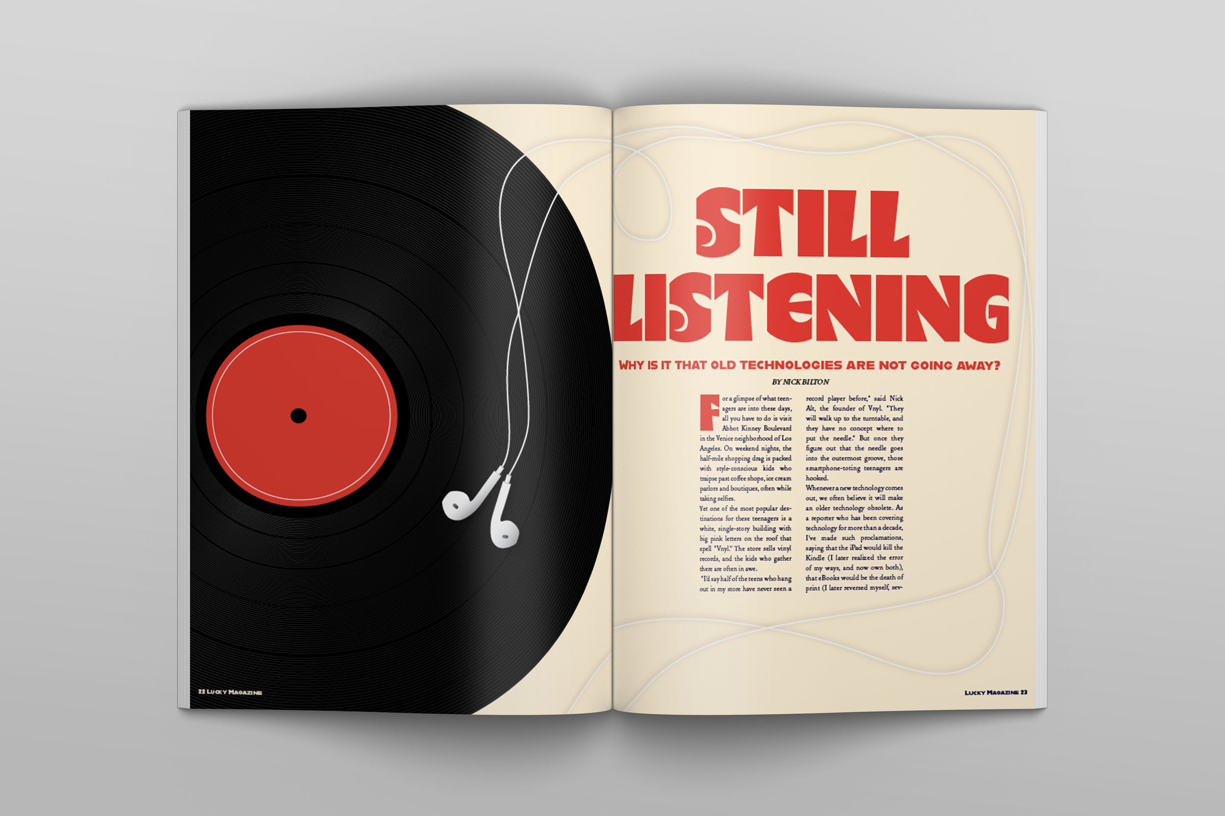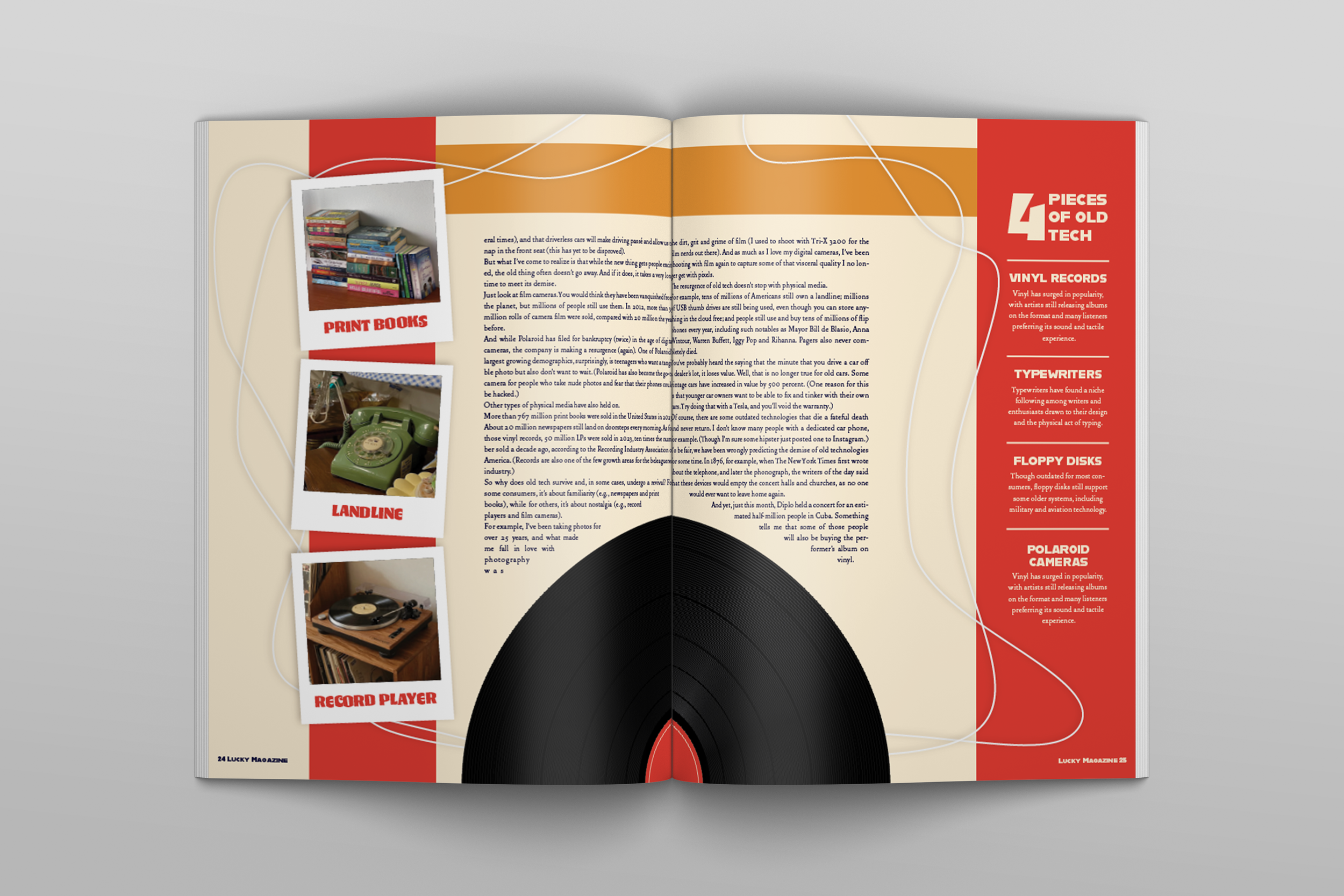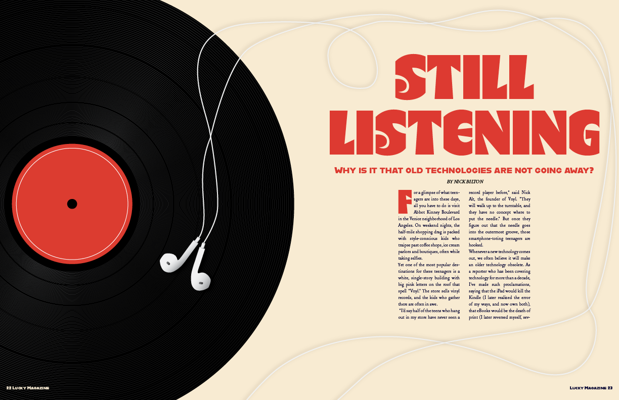
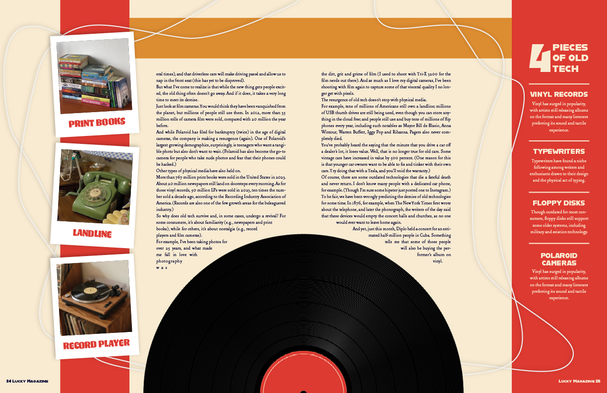
For this conceptual magazine design, I created a story about the resurgence of old technology like vinyl records, Polaroids, and print books. I wanted the lead image to show old and new technology interacting rather than simply placed together, which led me to create a graphic of a vinyl record paired with corded headphones. The simple composition communicates the idea clearly while still feeling intentional and visually interesting.
The headline, “Still Listening,” connects the continued use of older media with modern phrases while reinforcing the theme of past and present. I created the record and headphones in Adobe Illustrator, using the headphone cord as a visual element that guides the viewer through the layout and connects the pages together. This helped create movement throughout the spread while also filling space in a way that felt purposeful.
For the typography and color palette, I used a retro-inspired style with a groovy display font, a serif body font, and a red and cream color scheme to create a nostalgic feel. I also included a sidebar featuring examples of older technology that is still popular today, using Polaroid-style images to add variety and reinforce the theme. I originally included more items in the sidebar, but simplifying it helped create a cleaner and more balanced layout. Overall, this project helped me understand how imagery, typography, color, and layout choices work together to communicate a concept and create a cohesive visual story.
‘Still Listening’ Magazine Spread